The Chop Shop Post here to have your fellow members do some photo shop work to your ride...

Graphics Cover page

Old Nov 14, 2006 | 01:21 PM
  #1  
dblclutchin's Avatar
Thread Starter
Joined: May 2006
Posts: 688
From:
Default Graphics Cover page

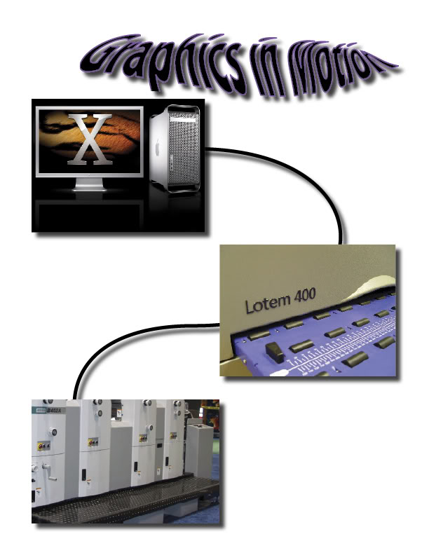
What do you guys think of the cover page I put together for my page layout class?
Name:  Coverpage.jpg
Views: 66
Size:  60.4 KB
 
Old Nov 14, 2006 | 01:32 PM
  #2  
mxs's Avatar
mxs
HCF Member
Joined: Jul 2005
Posts: 7,994
From: Rochester, NY
Default RE: Graphics Cover page

The text hurts my brain.
 
Old Nov 14, 2006 | 02:04 PM
  #3  
dblclutchin's Avatar
Thread Starter
Joined: May 2006
Posts: 688
From:
Default RE: Graphics Cover page

LOL i was wondering if I was the only one it didn't offend.
 
Old Nov 14, 2006 | 03:27 PM
  #4  
SoCaL.rider's Avatar
HCF Member
Joined: Jun 2005
Posts: 1,491
From: San Diego
Default RE: Graphics Cover page

man, to be honest...I think u can put more time into it, it sort of looks like u jus threw it together. The cord concept is a good idea, maybe make the pics tighter together and definetly change text to something clean and techno

jus my 2 cents, I do this kinda critiquing almost everyday.
 
Old Nov 14, 2006 | 06:26 PM
  #5  
dblclutchin's Avatar
Thread Starter
Joined: May 2006
Posts: 688
From:
Default RE: Graphics Cover page

Thanx guys. It's due tomorrow I'll work on it tonight and show you guys my changes.
 
Old Nov 14, 2006 | 06:47 PM
  #6  
kg3's Avatar
kg3
Joined: Jun 2006
Posts: 71
From:
Default RE: Graphics Cover page

make the cord more life like by adding a brush with the pen tool and then use a brush that is a circle so it will look ribbed
 
Old Nov 14, 2006 | 10:25 PM
  #7  
darksidepres's Avatar
HCF Member
Joined: Jul 2006
Posts: 386
From: Palmer,Texas
Default RE: Graphics Cover page

maybe some sort of background like a lightning storm or texture.
 
Old Nov 15, 2006 | 01:26 AM
  #8  
dblclutchin's Avatar
Thread Starter
Joined: May 2006
Posts: 688
From:
Default RE: Graphics Cover page

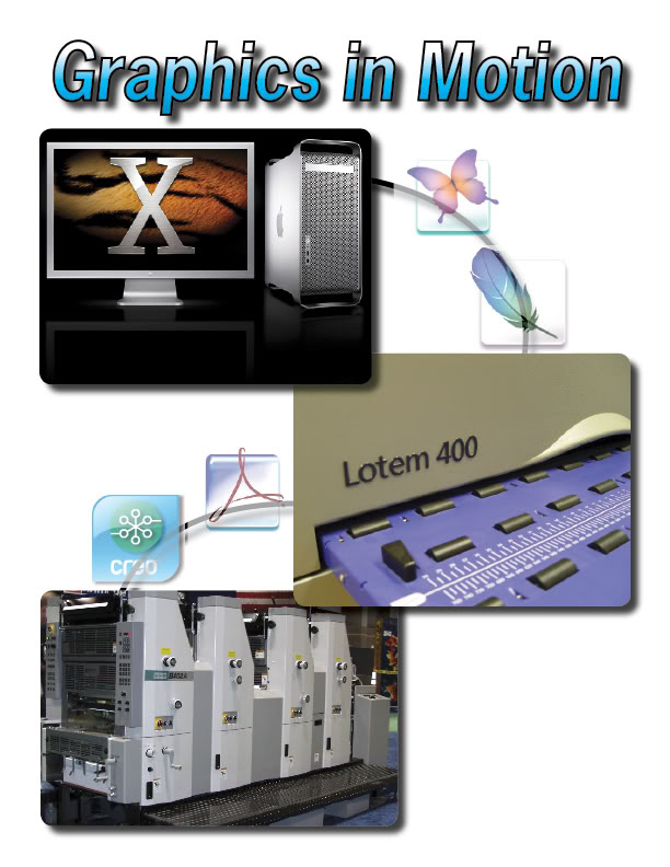
Ok I added a little more effort into it this time and I think it looks like I took more then 15 min to do it. Thanx for the input.

Name:  Coverpage-1.jpg
Views: 94
Size:  79.9 KB
 
Old Nov 15, 2006 | 03:09 AM
  #9  
SoCaL.rider's Avatar
HCF Member
Joined: Jun 2005
Posts: 1,491
From: San Diego
Default RE: Graphics Cover page

^ alright man looks a lot cleaner....I think u should lose the gradient and shadow on the text and make it solid black, then make the font a little smaller than ur top box and try not to center the it in the middle, maybe center it close to the top of the first first box

man that seems complicated, but it's not
 
Old Nov 15, 2006 | 05:17 PM
  #10  
darksidepres's Avatar
HCF Member
Joined: Jul 2006
Posts: 386
From: Palmer,Texas
Default RE: Graphics Cover page

Better
 

Thread Tools
Search this Thread

All times are GMT -8. The time now is 10:12 PM.