


new shirt design


Joined: Apr 2007
Posts: 331
From:
 RE: new shirt design
Personally I'd swap the front and the back. I'd also put the text up under the graphic, center ti and maybe make the graphic slightly smaller. Make that the front of the shirt and put the HCF logo on the back, at a size somewhere between the A snd B, but more like the size of B, and center it up near where the neck of the shirt is.
If it was me I wouldn't want all that text and graphics on my back.. I'd want that to be the first thing people see so they go "what's that all about" and then look at the back of the shirt and be like "oooh i see." Just my take on it tho.
If it was me I wouldn't want all that text and graphics on my back.. I'd want that to be the first thing people see so they go "what's that all about" and then look at the back of the shirt and be like "oooh i see." Just my take on it tho.


Thread Starter
|
formerly aryiman98civic
Joined: Jun 2005
Posts: 3,772
RE: new shirt design
ORIGINAL: crayzieman
Personally I'd swap the front and the back. I'd also put the text up under the graphic, center ti and maybe make the graphic slightly smaller. Make that the front of the shirt and put the HCF logo on the back, at a size somewhere between the A snd B, but more like the size of B, and center it up near where the neck of the shirt is.
If it was me I wouldn't want all that text and graphics on my back.. I'd want that to be the first thing people see so they go "what's that all about" and then look at the back of the shirt and be like "oooh i see." Just my take on it tho.
Personally I'd swap the front and the back. I'd also put the text up under the graphic, center ti and maybe make the graphic slightly smaller. Make that the front of the shirt and put the HCF logo on the back, at a size somewhere between the A snd B, but more like the size of B, and center it up near where the neck of the shirt is.
If it was me I wouldn't want all that text and graphics on my back.. I'd want that to be the first thing people see so they go "what's that all about" and then look at the back of the shirt and be like "oooh i see." Just my take on it tho.
Joined: Apr 2007
Posts: 331
From:
RE: new shirt design
Yeah, but I'm saying I think it'd be better on the back. With the graphic and "What series are you runnin'" on the front. People would see that "What series are you runnin'?" stuff and wonder what it's all about then see the back and understand. I'm just not a big fan of most of the graphics and text being on the back.. use the back as the advertisement. Have all the cool looking graphics and text on the front.

Laced with Sarcasm
Joined: Mar 2005
Posts: 15,280
RE: new shirt design
We're just trying to mix it up. You haven't been around long enough to have seen the last couple shirt designs, but for those of us who already have them, we need something different.
And where do you see "clutter?" Its one line of text and a tach[&:]
Danomatic, that "over the tit ****" is whatmost shops and legit car clubs use becuase it looks professional. We're already labeled as immature ricers by a lot of people simply due to the kind of cars we drive, so we might as well do what we can to be taken seriously
And where do you see "clutter?" Its one line of text and a tach[&:]
Danomatic, that "over the tit ****" is whatmost shops and legit car clubs use becuase it looks professional. We're already labeled as immature ricers by a lot of people simply due to the kind of cars we drive, so we might as well do what we can to be taken seriously

Joined: Apr 2007
Posts: 331
From:
RE: new shirt design
Yeah I know, I figured the design wouldn't change just because of what I said.. but this thread was for input, he asked for input so I gave my input.
I didnt say the shirt was cluttered, I don't think. I just thought it would look better with the back being on the front. To me, the tach and the text look like they should be on the front of the shirt, since that's the main design... it would just make me feel like I was wearing the shirt backwards, and I was just never that into Kris Kross.
Yes it's just a personal opinion so if everyone else likes it (which is seems they do) then go for it *shrugs* I just wont buy one this time around is all.
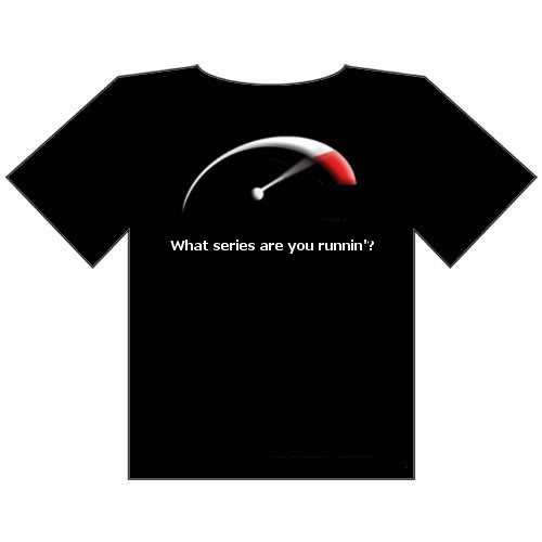
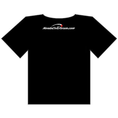
To illustrate my point, here:
I know I didn't get the text right and whatnot.. again this is just to illustrate what I mean.
Front:
Back:
I didnt say the shirt was cluttered, I don't think. I just thought it would look better with the back being on the front. To me, the tach and the text look like they should be on the front of the shirt, since that's the main design... it would just make me feel like I was wearing the shirt backwards, and I was just never that into Kris Kross.
Yes it's just a personal opinion so if everyone else likes it (which is seems they do) then go for it *shrugs* I just wont buy one this time around is all.
To illustrate my point, here:
I know I didn't get the text right and whatnot.. again this is just to illustrate what I mean.
Front:
Back:

